Inkling on your phone
Checked against Inkling on , 3 min read
Open Inkling in your phone’s browser: the same answers, with a tab bar along the bottom and the follow-up box at the foot of a discussion.
Before you start
Sign in with the same email and password you use on a computer. Your discussions, notes and allowances are the same everywhere.
Get around
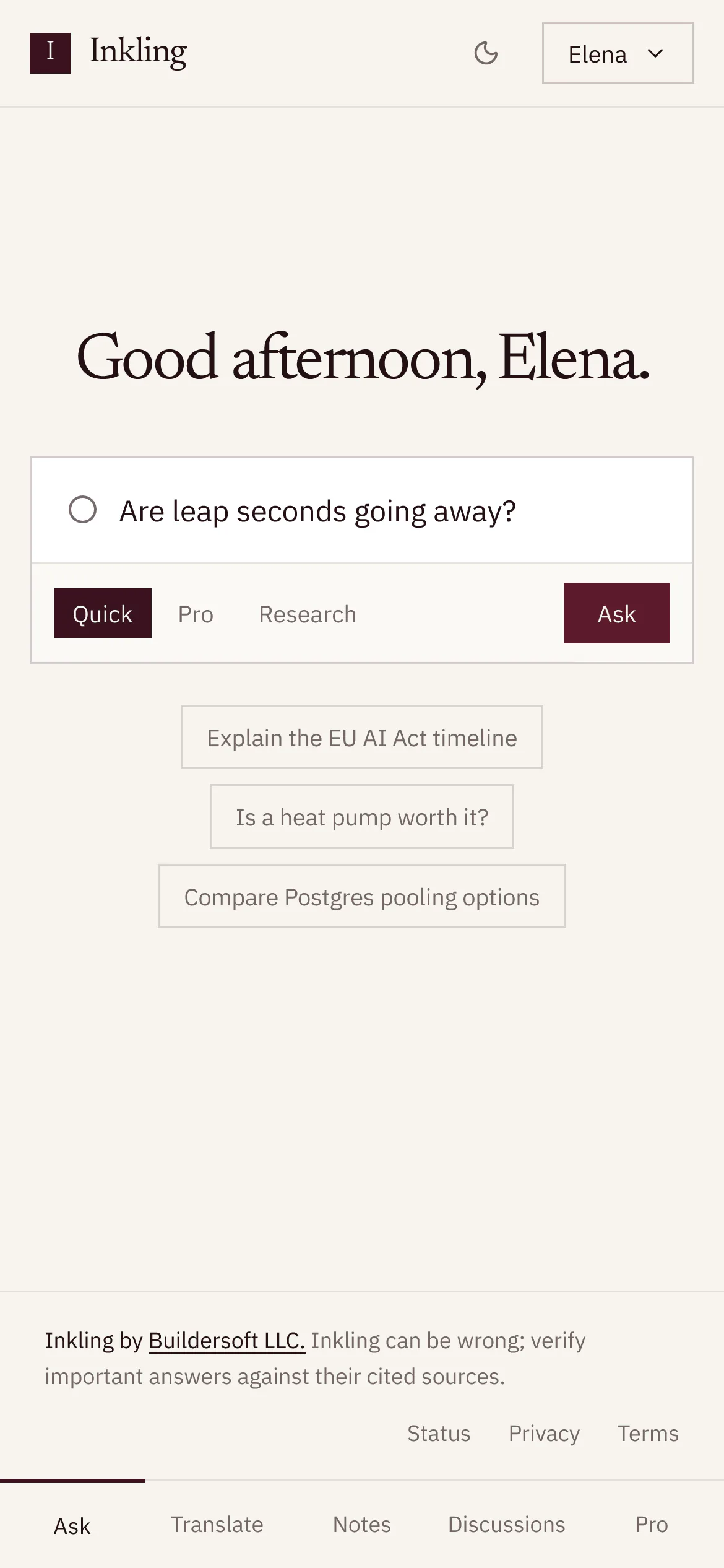
On a narrow screen the header keeps the Inkling mark, the theme button and the account menu, and a tab bar along the bottom takes over from the header’s links:
- signed in: Ask, Translate, Notes, Discussions, Pro
- signed out: Ask, Translate, Discussions, Pro
Pro shows what each plan includes. Settings, Shared pages and Sign out are in the account menu.
Ask and read answers
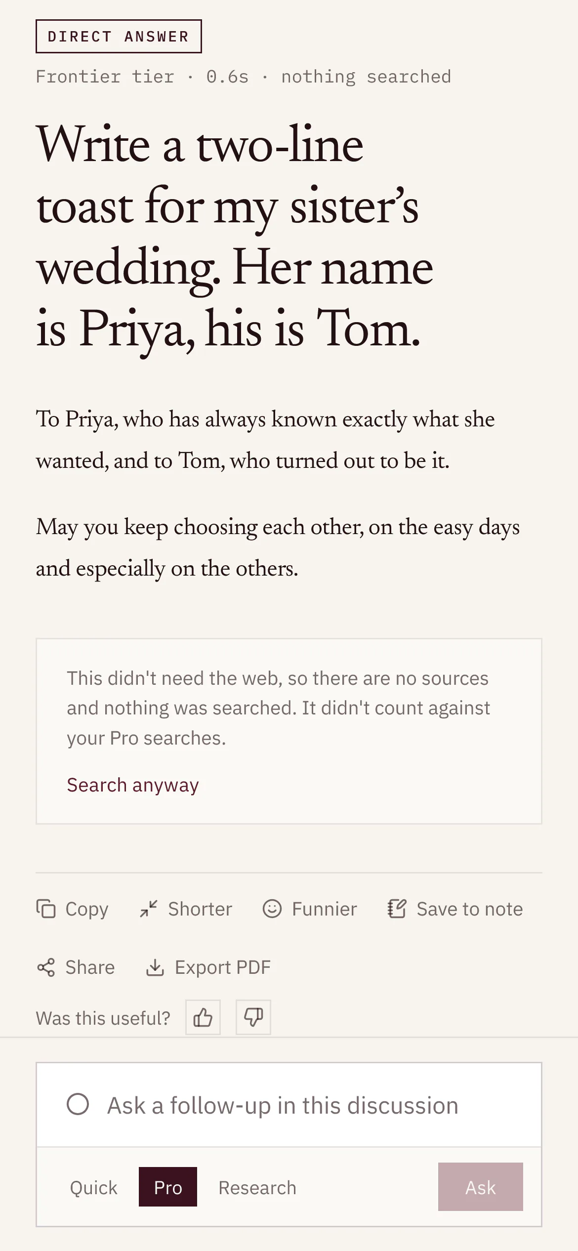
- In a discussion, the tab bar gives way to the follow-up box, “Ask a follow-up in this discussion”, which stays at the foot of the screen. The Inkling mark at the top takes you home.
- The sources are listed under the answer rather than beside it.
- A research report’s Contents folds into a single line above the answer. Tap it to open the list.
- Save to note opens as a sheet from the bottom of the screen.
Notes on a phone
- In a note, the bar at the foot reads Sources 4 · Inkling, with the note’s own count of sources. Tap it to open Sources in this note and the Inkling column as a sheet.
- While you write, a toolbar docks above the keyboard with the line type, formatting, Link, Cite and Ask Inkling.
- On the Todos page, Hand to Inkling and each row’s other actions are always shown, since there is no hover on a touch screen.
Translate on a phone
- Type in the box at the foot of the screen, “Type, paste, or attach a file”. There Enter translates and ShiftEnter starts a new line.
- The original and the translation are stacked rather than side by side.
- On Pro, a translated document’s result has Show original, which opens the source text under the translation, and Check these, with how many there are, such as Check these (5), which folds the list of things to check.
Where things are
| On a wide screen | On a phone |
|---|---|
| Links in the header | The tab bar |
| Sources beside the answer | Sources under the answer |
| Contents in the rail | Contents folded above the answer |
| Sources in this note and Inkling beside the note | Sources 4 · Inkling, as a sheet |
| A toolbar over your selection | A toolbar docked above the keyboard |
| Translate’s panes side by side | Stacked, with the box at the foot |
Good to know
- Inkling’s layout is checked automatically at 390 px wide, a common phone width, in WebKit, the engine Safari uses. The checks fail if a page is wider than the screen or a control runs past its right edge.
- The theme follows your phone’s light or dark setting until you choose one; see Display name and appearance.
- Most of this also applies to a narrow browser window on a computer.